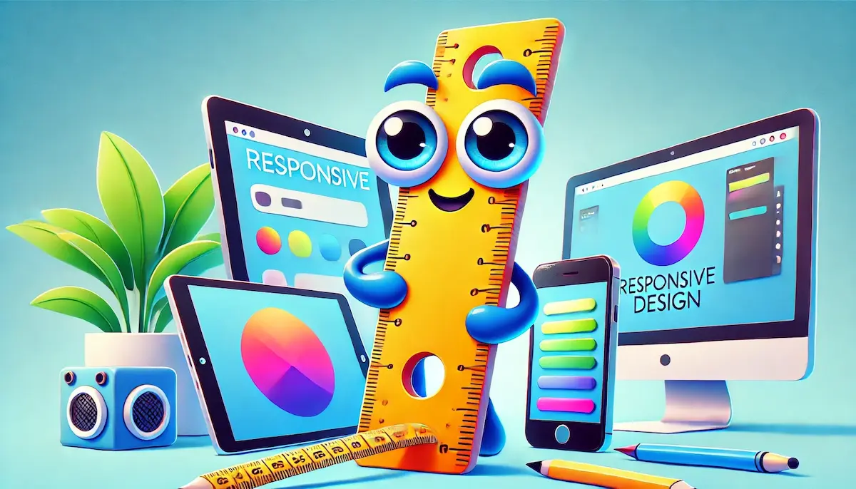
Responsive design is a web development approach that ensures websites and applications work well across a wide range of devices, from desktops to smartphones. The goal is to create a seamless user experience regardless of the device being used. Responsive design involves using flexible layouts, images, and CSS media queries to adapt the content to different screen sizes and orientations.
What is Responsive Design?
Responsive design is a method of designing web content so that it automatically adjusts to fit the screen size and resolution of the device on which it is viewed. This means a single website can provide an optimal viewing experience on desktop computers, tablets, and mobile phones, eliminating the need for separate versions of the site for each device.
The Importance of Responsive Design
Responsive design is crucial for several reasons:
- Enhanced User Experience: By adapting to different screen sizes, responsive design ensures that users have a consistent and enjoyable experience, whether they are using a phone, tablet, or desktop.
- Improved SEO: Search engines like Google favor mobile-friendly websites. Responsive design can improve a site’s search engine rankings, making it easier for users to find.
- Cost-Effective: Maintaining a single responsive website is more cost-effective than creating and maintaining multiple versions of the same site for different devices.
- Increased Reach: With the growing use of mobile devices, responsive design ensures that all users can access and navigate the site easily, regardless of the device they use.
- Future-Proofing: Responsive design provides a solution that is adaptable to future devices and screen sizes, ensuring longevity and relevance.
Key Principles of Responsive Design
Several principles guide effective responsive design:
- Fluid Grids: Use flexible grid layouts that resize elements proportionally, rather than using fixed pixel values. This allows the layout to adapt to different screen sizes.
- Flexible Images: Ensure images scale and resize within their containing elements without losing quality. Use CSS techniques to control how images behave in different contexts.
- Media Queries: Use CSS media queries to apply different styles based on the device’s characteristics, such as width, height, and orientation. This allows for specific design adjustments to optimize the layout.
- Viewport Meta Tag: Set the viewport meta tag in HTML to control the layout on mobile browsers. This ensures that the page scales correctly on various devices.
- Mobile-First Approach: Design for the smallest screen sizes first and progressively enhance the design for larger screens. This approach ensures that essential features are prioritized for mobile users.
The Process of Implementing Responsive Design
Implementing responsive design involves several key steps:
- Plan and Research: Understand the target audience and the devices they use. Plan the content structure and layout to ensure it works well on all devices.
- Design with Flexibility: Create wireframes and mockups that illustrate how the layout will adapt to different screen sizes. Focus on a fluid grid system and flexible elements.
- Use Media Queries: Implement CSS media queries to apply specific styles for different devices. Test the design at various breakpoints to ensure a smooth transition between screen sizes.
- Optimize Images and Media: Use responsive image techniques, such as the
srcsetattribute and CSS image resizing, to ensure images look good on all devices. - Test Across Devices: Test the responsive design on various devices and browsers to identify any issues and ensure a consistent experience. Use emulators and physical devices for comprehensive testing.
Examples of Responsive Design Techniques
- Flexible Grid Layouts: Use percentage-based widths for columns in a grid layout. For example, instead of setting a column to 300px, set it to 30% of the container’s width.
- Responsive Navigation: Implement navigation menus that collapse into a hamburger menu on smaller screens. This keeps the navigation accessible without taking up too much space.
- Fluid Images: Use CSS to set the maximum width of images to 100% of their containing element. This ensures that images resize proportionally within their containers.
Conclusion
Responsive design is essential for creating websites and applications that provide a consistent, high-quality user experience across a wide range of devices. By following key principles and best practices, designers can ensure their content is accessible, engaging, and effective, regardless of the screen size.
Blockfine thanks you for reading and hopes you found this article helpful.
